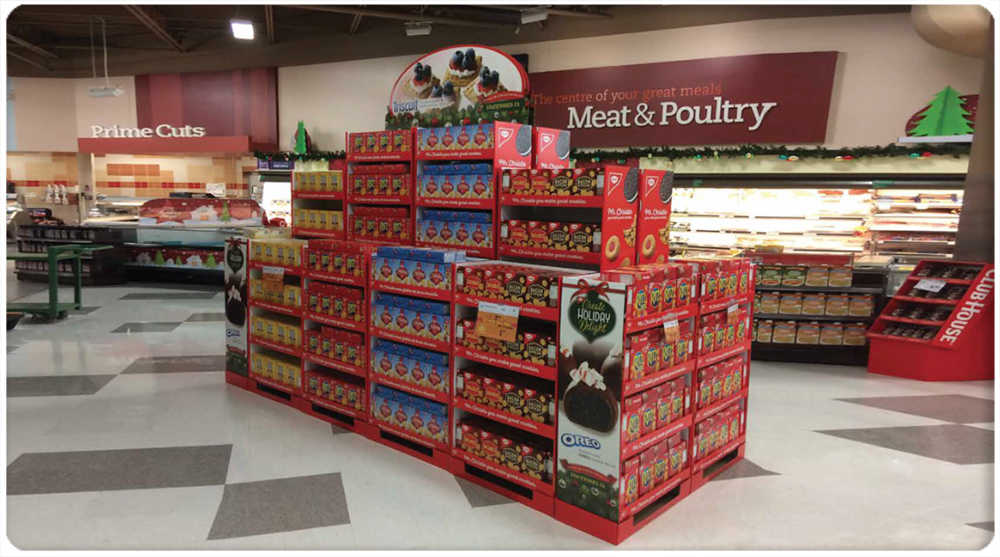
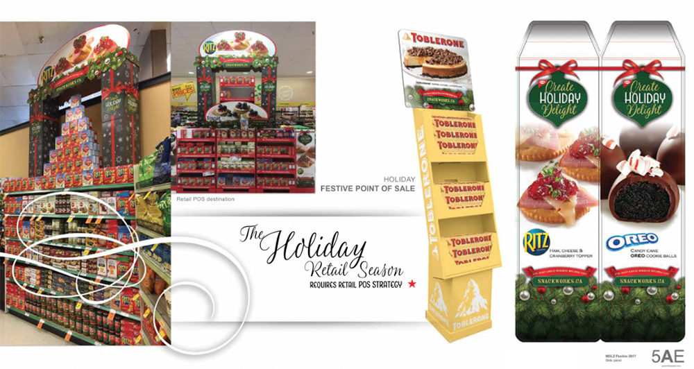
The Canadian retail landscape during the Holiday Season is highly competitive. In order to stand out you need designs that transform stacks of product into a destination. For this project we used customized Holiday vectors from our own Vector Library. We matched it with beautifully art directed photography. Not artificial emulations. No AI art was used for this project.
Holiday Typography
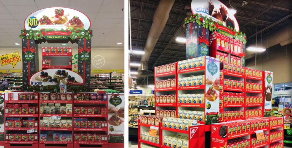
Typesetting is very important. Especially when you are speaking to a consumer that is in motion. You want to choose fonts that fit the theme but are also visible in the grocery.
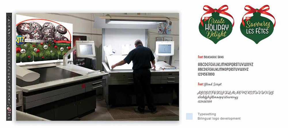
Master offset printing technicians matched colours and made certain that the registrations matched. The end result being high quality printing on corrugate.
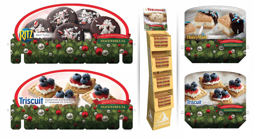
Header Cards
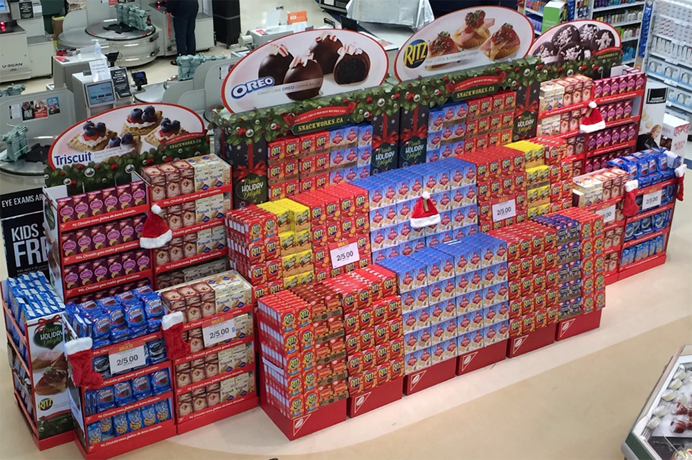
Fun Fact: My Daughter was 10 years old at the time. She photographed the plate used on all of the point of sale material nation wide. It was a great learning experience for her and an exciting thing to see her work at the grocery.
To cap retail large and small bookcases we used large recipe photos on a blanket of evergreens and ornaments.
Retail Archway
Sized to span a standard pallet of product this design went through several versions. each of them with a nice holiday touch and an illustration style that resonated well with shoppers.
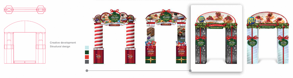
Design and Production Art
Part of being a one stop shop for retail is design is an ability to build all the steps in between. We specialize in the minutia that brings a final series to market that looks like this. Very proud of the work and the record-breaking sales that came as a result of it. Great teamwork.
*This project was produced at Proprint Services Inc.
**Structural Design by Naush Ibrahim