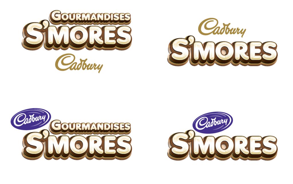
Bilingual Branding
Part of being a designer in Canada is that you have to represent English and French equally in market. Logos must be designed in pairs with thoughtfulness and care. There is a formula that we have established at Juggernaut that is baked into the DNA of every brand that we touch. These logos were typeset and designed in Adobe Illustrator. Pulling colour tones from the gooey chocolate treats for which this program is centred on. Appetite appeal and tangibility are infused in this logo set to draw consumers in to touch.
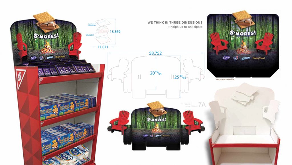
Point of Sale Design for the Canadian Market
In addition to the branding, engaging point of displays were designed to evoke the charm of cottage life at home. These winged header cards were printed on both sides so that they could fold in a pair of slanted red chairs around a warm campfire.
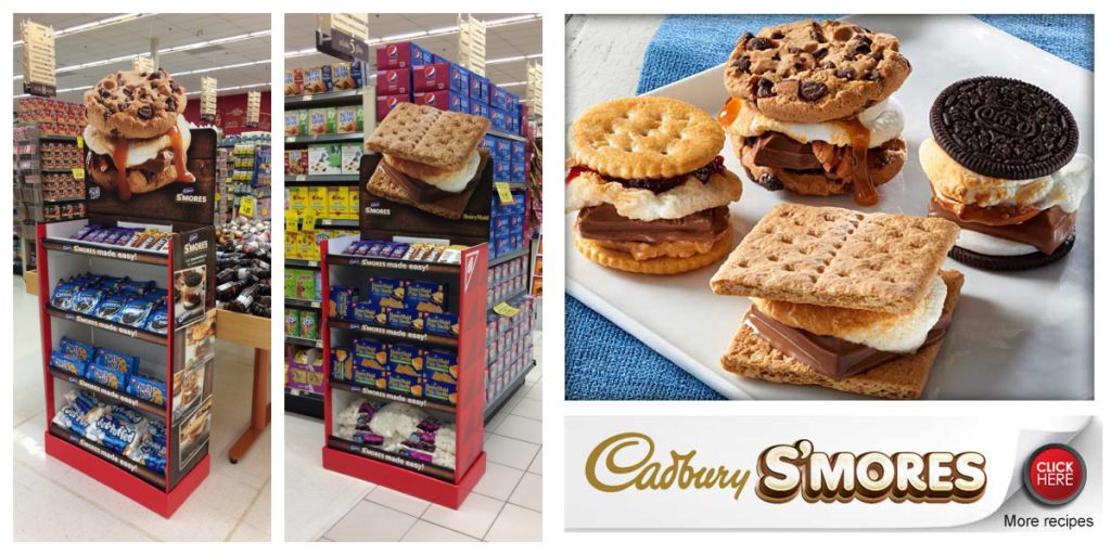
The following year was a recipe driven program. Propelled by the success of the year previous. The creative brief was to go BIG. Not just with flavour but visual area. Inviting consumers to go online for exciting recipe twists to this classic summer delight. Using real product photography to capture the details. *No AI art required or requested.
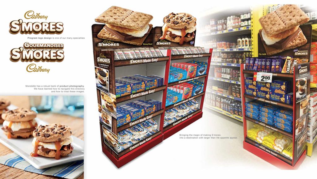
Various bookcases – Standardized headers
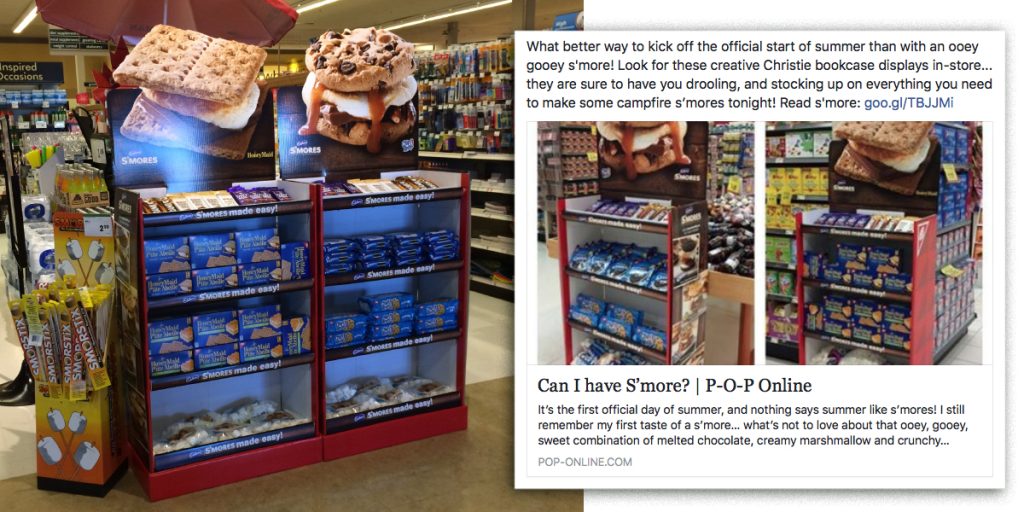
Social media buzz around the campfire
Retail point of sale display design is a specialized skillset. So when it is recognized by other design peers it feels pretty good. Sure, sales is the metric that clients measure success. But there is a satisfaction that lies with knowing your design motivated someone to take action. It was nice to see this one catch a little heat during its brief Summer retail window across Canada.