Fruit cartage company
The story behind this logo is very special. For a few reasons. The first is that the client wanted to name his state of the art Produce Cartage Company after his Daughter. As a Father with a Daughter of my very own, I could relate to this. This touching gesture was also an opportunity to immortalize Charlotte. carrying her name across the country.
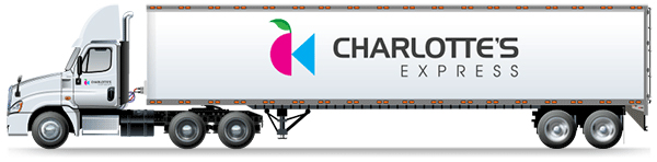
The icon is made up of half a piece of fruit and an arrow to imply direction. When the arrow touches the green fruit it instantly changes colour. This implies ripening and motion. The leaf is a direct pick up of the leaf from the parent company Kopke. When the two pieces of the icon come together they form Charlotte’s initials: CK. This hidden “easter egg” has become a point of conversation and a welcome surprise when revealed.
Swift Delivery
This logo came together very quickly. After a brief evening conversation with the client William, I instantly visualized it then quickly put together a version for review. It was approved on the first attempt with no brief and no revisions. It is a testament to good client communication and an ability to visualize the final brand.
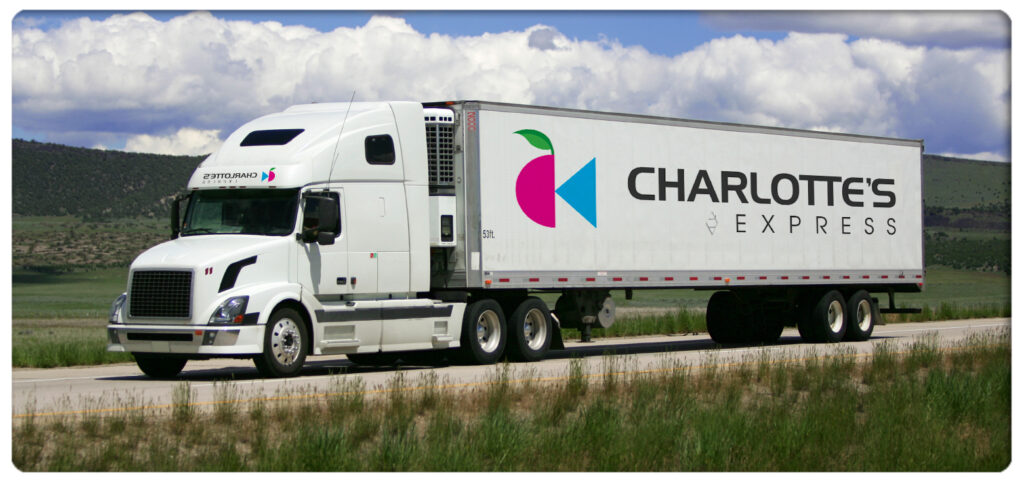
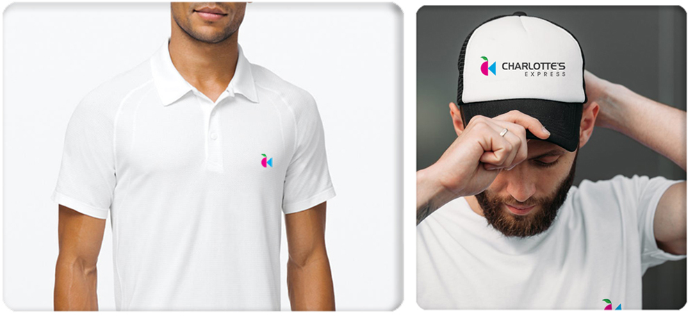
I’m very proud of this logo and how easy it was to create. Seeing it emblazoned on the side of a trailer or on a baseball cap really makes me feel good. I often think about the night that it came to be and what a successful company it has become.
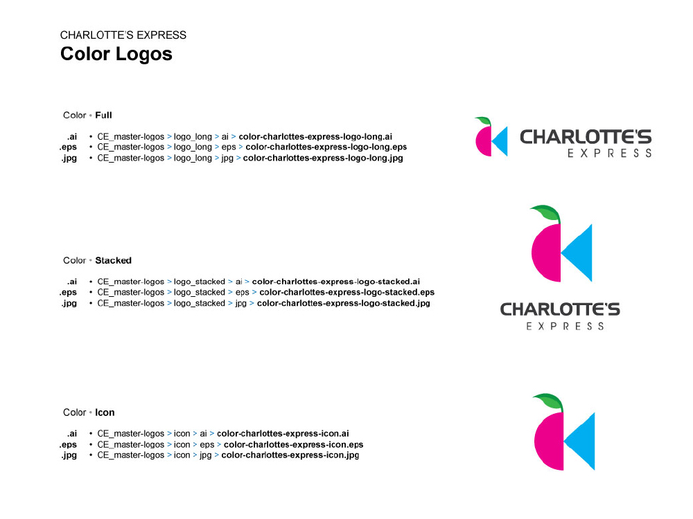
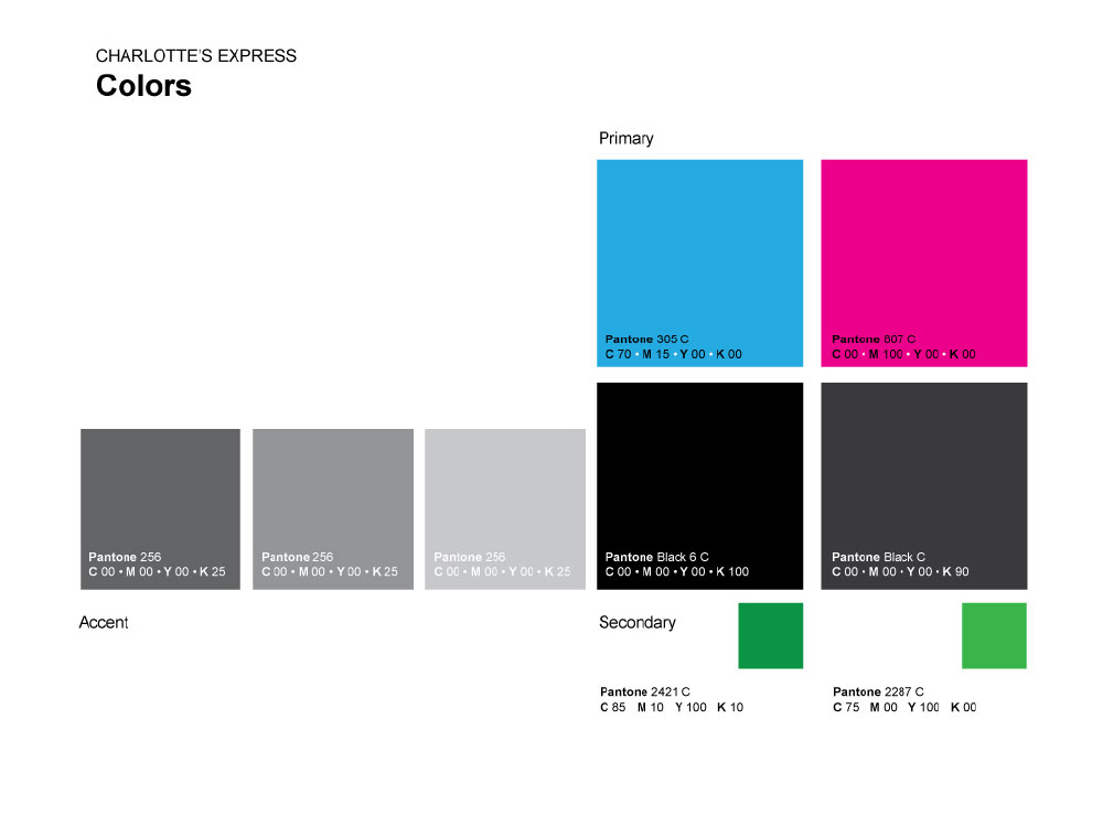
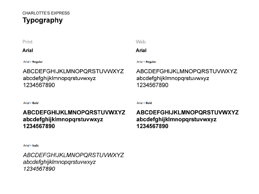
Brand Standards
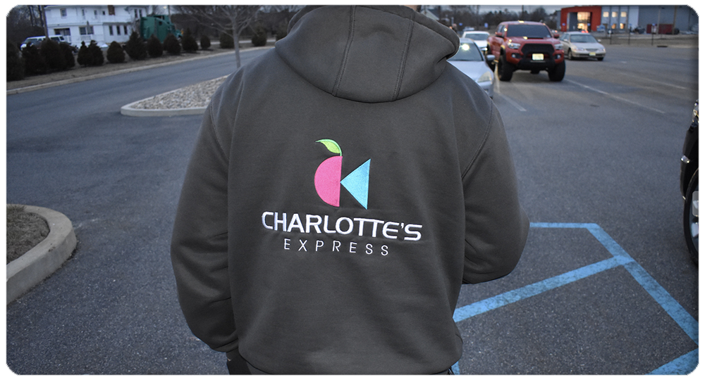
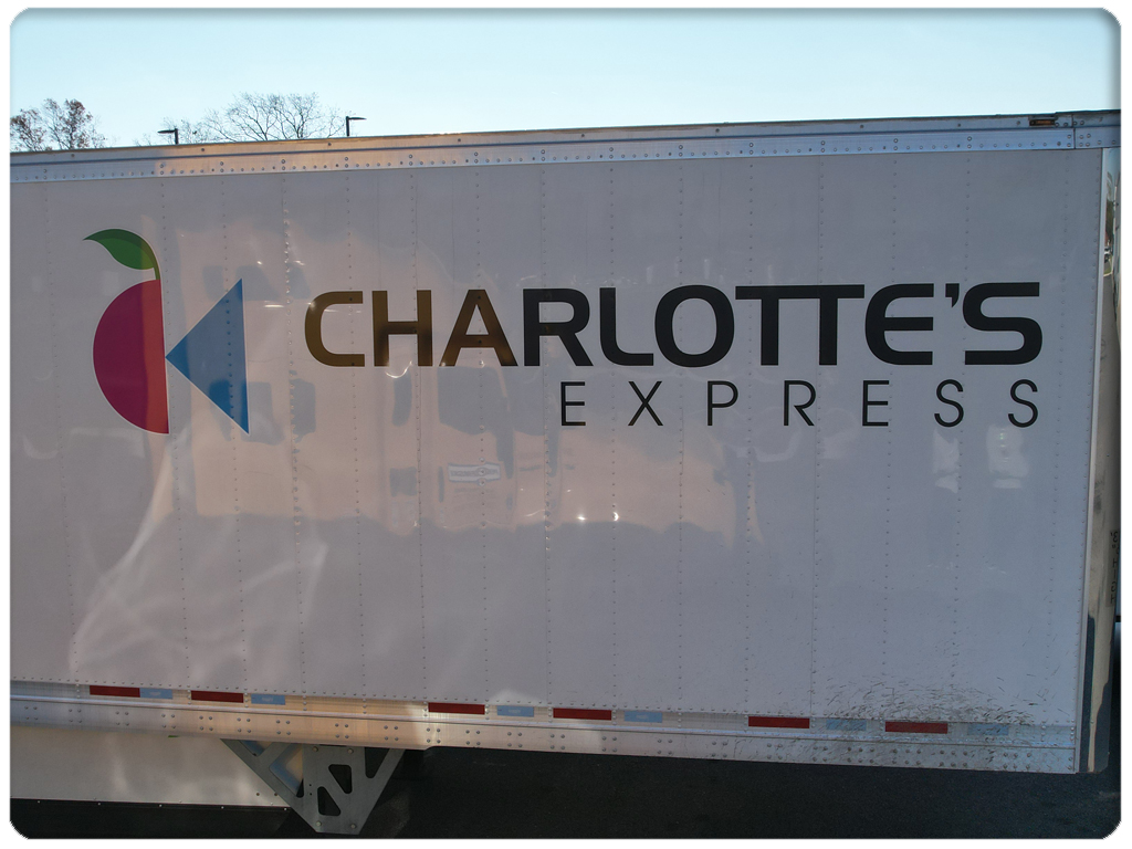


Keep on Trucking
I am excited to see how Charlotte’s Express has grown over time.